Included with the release of .NET 9.0 was a sweet new feature for WPF: the Fluent theme. Using this new theme allows us to easily create a modern-looking desktop app that even supports Light and Dark modes (yes!).
A project I recently started working on involves creating a new WPF application, so I was thrilled to see how easily it integrated with a Windows 11 desktop.
While working with the new Fluent theme, however, I’ve encountered a few…inconsistencies. Applying custom styles to controls was leading to strange results, among other things.
As it turns out, the odd behavior I was observing was due to the very nature of what this new Fluent theme actually is, and how it was implemented into the larger WPF ecosystem.
Let’s take a look at an example of how things can get complicated when you apply this (otherwise awesome) new Fluent “theme”.
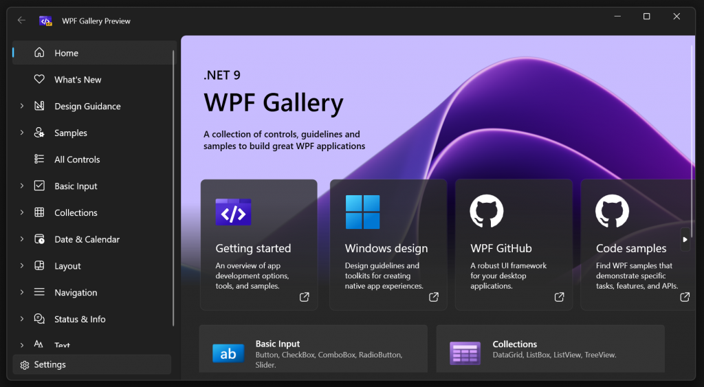
A Navigation Button. It Looks Good.
Let’s say we want to create a navigation button similar to the “Back” button shown in the upper-left corner of the WPF Gallery app (see screenshot above).
Using the Fluent theme, a button’s background and border color will change if the button becomes disabled (which will be the case if we’re currently at the beginning of our navigation history). We don’t want that for our Back button.
Instead, we want only the foreground color to change when a button switches between enabled and disabled. To achieve this, we can draft up something similar to how the WPF Gallery app does it:
Our Back Button
<Button IsEnabled="{Binding IsEnabled}"
Background="Transparent"
BorderBrush="Transparent"
VerticalAlignment="Center"
HorizontalAlignment="Center">
<Button.Resources>
<SolidColorBrush x:Key="ButtonBackgroundDisabled" Color="Transparent" />
<SolidColorBrush x:Key="ButtonBorderBrushDisabled" Color="Transparent" />
</Button.Resources>
<TextBlock FontFamily="{StaticResource SymbolThemeFontFamily}"
FontSize="12"
Text=""
VerticalAlignment="Center">
<TextBlock.Style>
<Style TargetType="TextBlock">
<Style.Triggers>
<Trigger Property="IsEnabled" Value="False">
<Setter Property="Foreground"
Value="{DynamicResource TextFillColorDisabledBrush}"/>
</Trigger>
</Style.Triggers>
</Style>
</TextBlock.Style>
</TextBlock>
</Button>
This will produce something that looks like this:
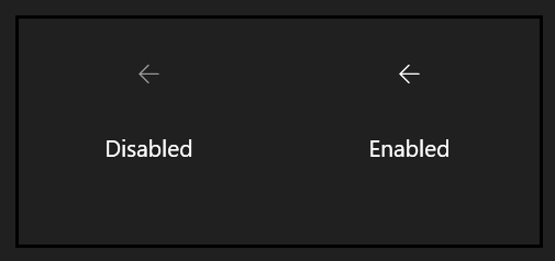
Looks exactly how we want it to.
Our Button With a Style Applied. It Looks Bad.
Perhaps we have several navigation buttons that are styled similarly. Let’s create a Style for our navigation buttons that contains some common properties. This is a very common practice in WPF design.
A Navigation Button Style
<Style x:Key="NavigationButtonStyle" TargetType="Button">
    <Setter Property="Background" Value="Transparent"/>
    <Setter Property="BorderBrush" Value="Transparent"/>
    <Setter Property="VerticalAlignment" Value="Center"/>
    <Setter Property="HorizontalAlignment" Value="Center"/>
</Style>
Pretty simple style. We’re definitely not engaging in any unorthodox development practices here. Let’s apply it to our button.
Our Back Button Using This Style
<Button IsEnabled="{Binding IsEnabled}"
Style="{StaticResource NavigationButtonStyle}">
<Button.Resources>
<SolidColorBrush x:Key="ButtonBackgroundDisabled" Color="Transparent" />
<SolidColorBrush x:Key="ButtonBorderBrushDisabled" Color="Transparent" />
</Button.Resources>
<TextBlock FontFamily="{StaticResource SymbolThemeFontFamily}"
FontSize="12"
Text=""
VerticalAlignment="Center">
<TextBlock.Style>
<Style TargetType="TextBlock">
<Style.Triggers>
<Trigger Property="IsEnabled" Value="False">
<Setter Property="Foreground"
Value="{DynamicResource TextFillColorDisabledBrush}"/>
</Trigger>
</Style.Triggers>
</Style>
</TextBlock.Style>
</TextBlock>
</Button>
Cool. Everything should look the same right?
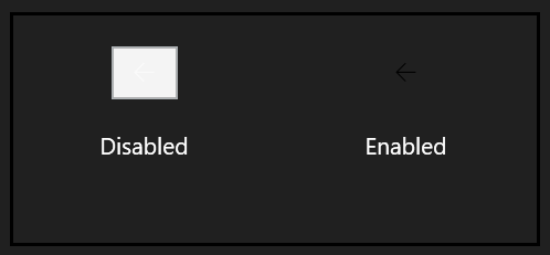
Hmm. This does not look good. It should have looked the same as before…and it would have, if only the Fluent theme were treated like an actual theme by WPF.
WPF and Themes: A Clumsily Written History
The whole notion of themes when it comes to WPF and Windows is a bit antiquated.
WPF first emerged during the good ol’ days of Windows XP. On Windows XP, we could switch between several “visual styles”, such as “Luna”, “Classic”, etc.
Unsurprisingly, a number of theme assemblies corresponding to some of these visual styles have long shipped with WPF:
PresentationFramework.ClassicPresentationFramework.Luna
The idea was that if the user changed the OS’s visual style from Classic to Luna, WPF’s theming system would then switch over to the relevant theme assembly, and everything would look copasetic.
Then came Windows 7, 10, and on. The concept of discrete visual styles was dropped, and instead, we have a more customizable…color-picker-laden theme experience.
Nowadays, the theme assembly that gets loaded is primarily determined by the OS version you are running, along with some other criteria. Automatically. The styles contained in these theme assemblies, loaded in this manner, receive special treatment that our normal, plebian styles do not.
The Fluent Theme Is Treated Like a Pleb
If you refer to the instructions on how to apply the Fluent theme, you’ll notice that you’re required to manually include the theme’s resources into your App.xaml. This makes the lovely Fluent styles no more special than our own, pleb styles, and WPF won’t treat them as an actual system theme.
A theme assembly, when loaded by the framework, replaces the Style assigned to each built-in control’s internal ThemeStyle property.
The style assigned to a control’s ThemeStyle property acts as its default style, which should not be confused with the more commonly discussed implicit style:
An Implilcit Style
<Style TargetType="Button">
    <Setter Property="Background" Value="Red"/>
</Style>
An implicit style, like the one above, will be automatically applied to all instances of the targeted type within the element in which the resource dictionary containing said style is defined.
The only properties affected by an implicit style, however, are the ones explicitly defined in the style. All other properties will have their values based on the default style (ThemeStyle).
Well, the Fluent theme’s resources are not loaded as theme styles; therefore, they are not the default styles. If you apply a custom style to a control, you lose all the Fluent-related colors, templates, etc.
So that’s why we ended up with a big white box.
Explicitly Basing a Style on the Default Style
There’s sort of a workaround to this, and that’s basing the style on the default style for the type:
<Style x:Key="MyStyle" TargetType="Button" BasedOn="{StaticResource {x:Type Button}}">
    <Setter Property="Background" Value="Red"/>
</Style>
If the style is defined local to our application, then doing the above should result in our style being based on the theme’s default style.
However, if you are using any controls defined in an external library, this will not work, unless the control is directly merging the Fluent theme into its resources (which is most likely not the case).
So, not ideal.
What Do?
Well, I love this theme. I’m hoping that Microsoft will add support for loading it as an actual system theme.
Until then, however, you have to be careful with what you style and how you style it. That’s painful to think about, but beauty is pain, I suppose.
Instead of defining a style with triggers to control various aspects, such as the disabled border color, you’ll want to manually override control color sources (which can be done by simply declaring a local resource with the same key).
You can also always copy the style and template for a control from Fluent’s XAML into your own project, and then base your styles on that. This is probably something you’d want to avoid.
Good luck!